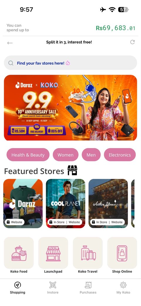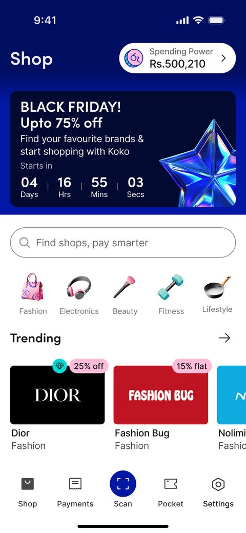
Koko Advertiser Portal Case study
Giving merchants control of their presence inside Koko.
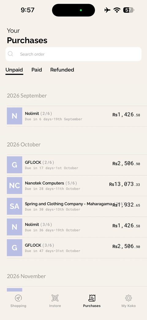
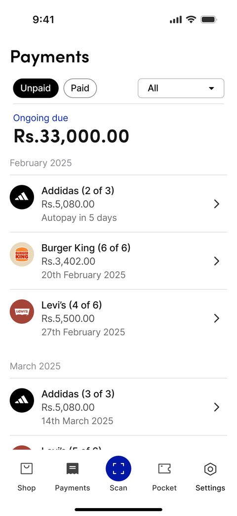
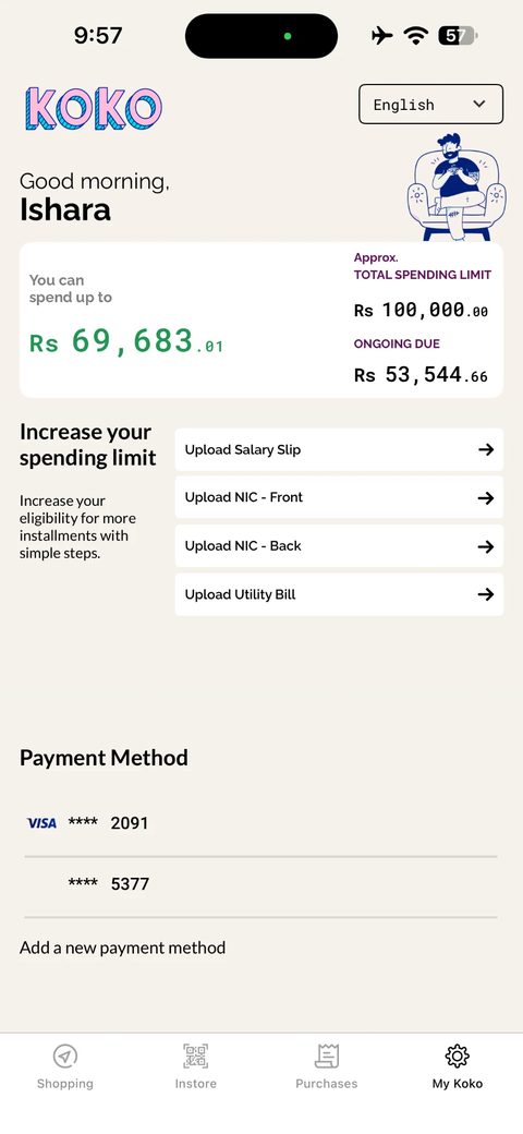
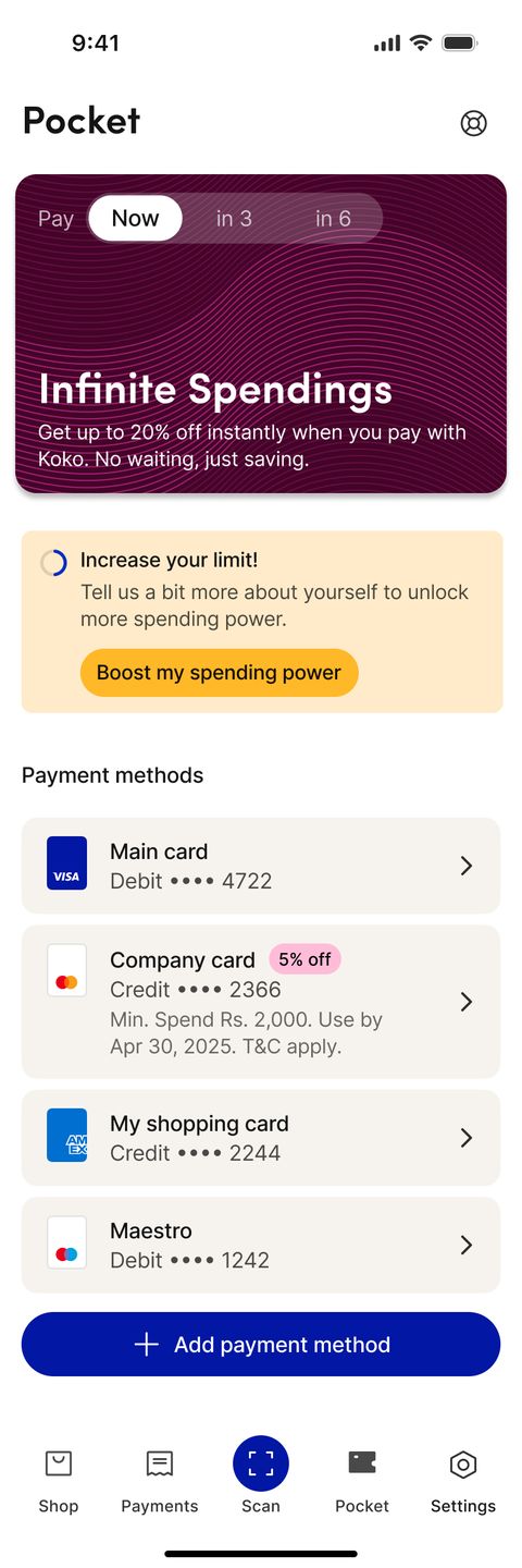
Turning unused Koko app placements into a fixed-price, self-service booking experience, from choosing a space to seeing what it returned.
Read the story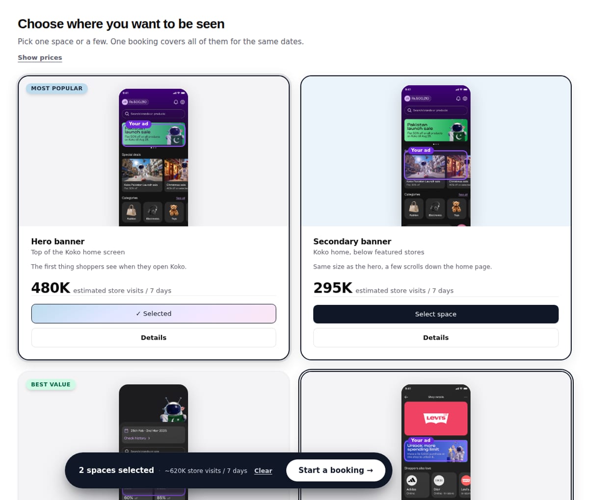
A closer look.
The product is live. My deliverables were the UX flows, booking logic, and working prototype. Inventory calculations model capacity, not measured revenue.
01 / The problem
An audience merchants could not reach on their own.
Koko’s app placements were curated by a marketing team. Merchants wanted visibility beyond their store page, while Koko needed revenue beyond transaction fees. The brief was to make that space something a merchant could buy without a sales call.
I designed the booking journey, pricing and availability logic, and the screens that explain those rules. The result was six spaces sold at fixed prices, using familiar decisions: where to appear, when to run, and what to pay.
02 / The pivotal decision
Dates before positions.
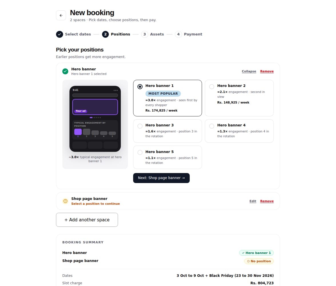
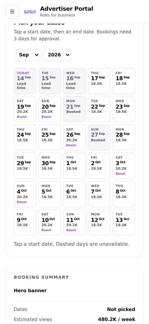
Space and position look like related choices. But availability depends on the space, the position, and the dates together. Asking for a position first would only expose a conflict after the merchant had made their choice.
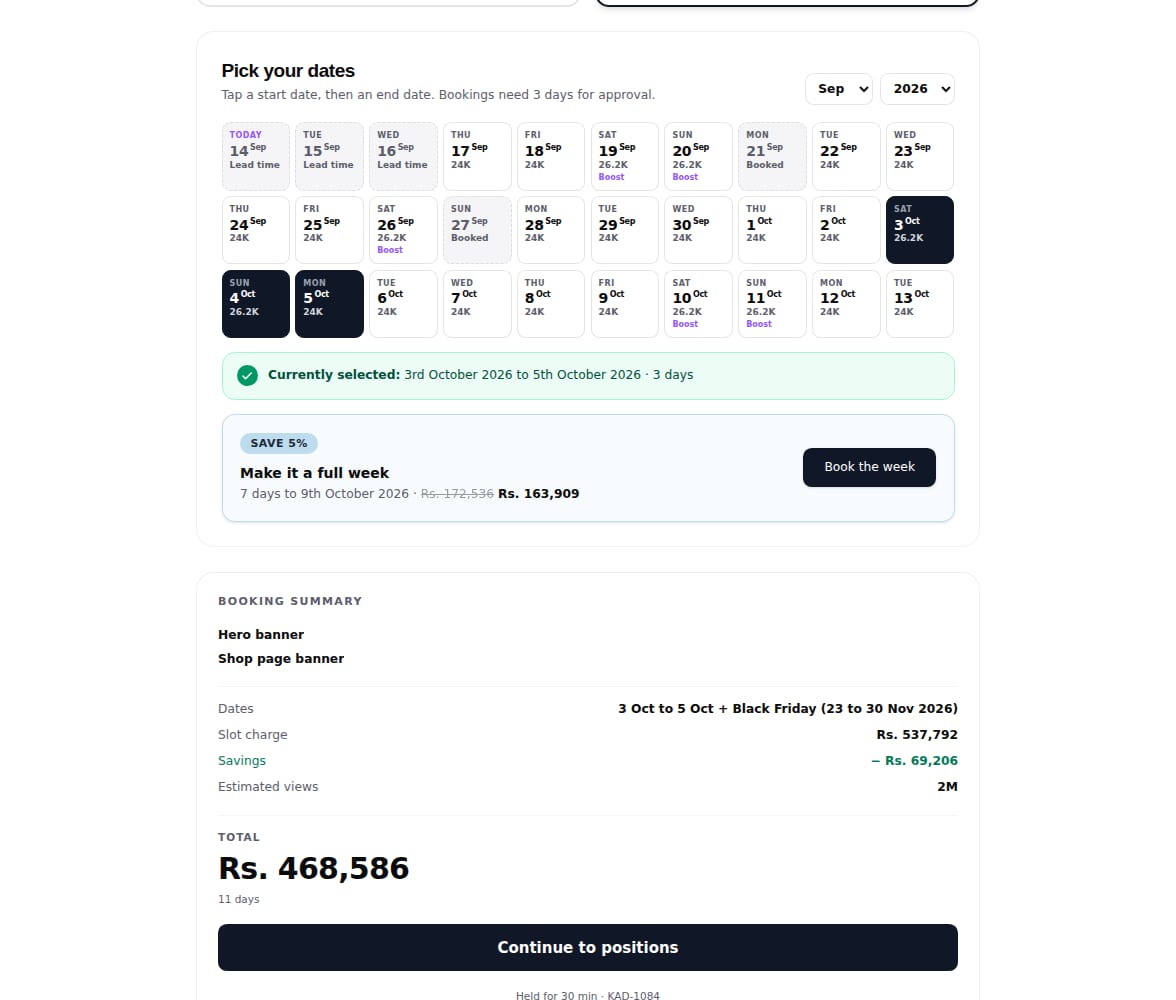
Putting dates second means availability can be checked before positions are offered. The flow resolves one decision at a time: space, dates, position, artwork, payment. A merchant should not have to keep going backwards to find a slot they can actually book.
03 / Make the purchase legible
Explain the value, then introduce the next choice.
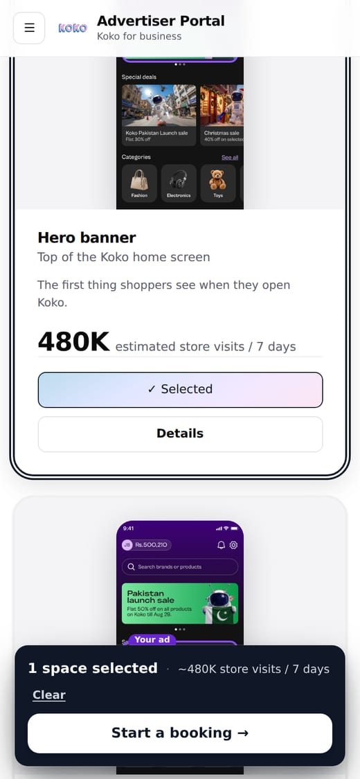
The landing page leads with app previews and estimated views; prices are off by default. A larger details view explains the placement without making availability claims before dates exist.
The same restraint carries into the booking. Selecting a campaign opens its dates and hides the other campaigns. A bundle is offered only once the first space’s position is settled. The aim is to keep an unfamiliar purchase understandable at each step.
- One campaign open at a time.
- One extension offer, only when the longer period is bookable.
- A second-space offer after the first placement is decided.
Traffic estimates and popularity labels need operational benchmarks before launch.
04 / Remove a practical barrier
No artwork should not mean no booking.
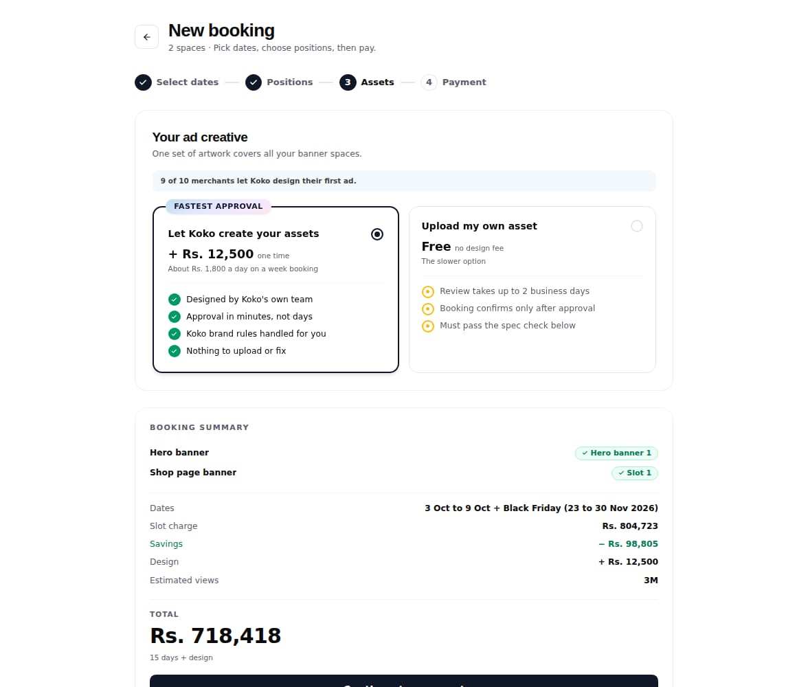
A first-time advertiser may not have a designer or a correctly sized banner. The artwork step offers a Koko design service alongside an upload route for merchants who already have creative ready.
For uploads, the interface checks file size, format, and resolution. A failed check explains the requirement, so the merchant knows what to replace without restarting the booking. The choice also makes the fee and review timing visible.
05 / Make the commitment clear
Every change to the total has a visible reason.
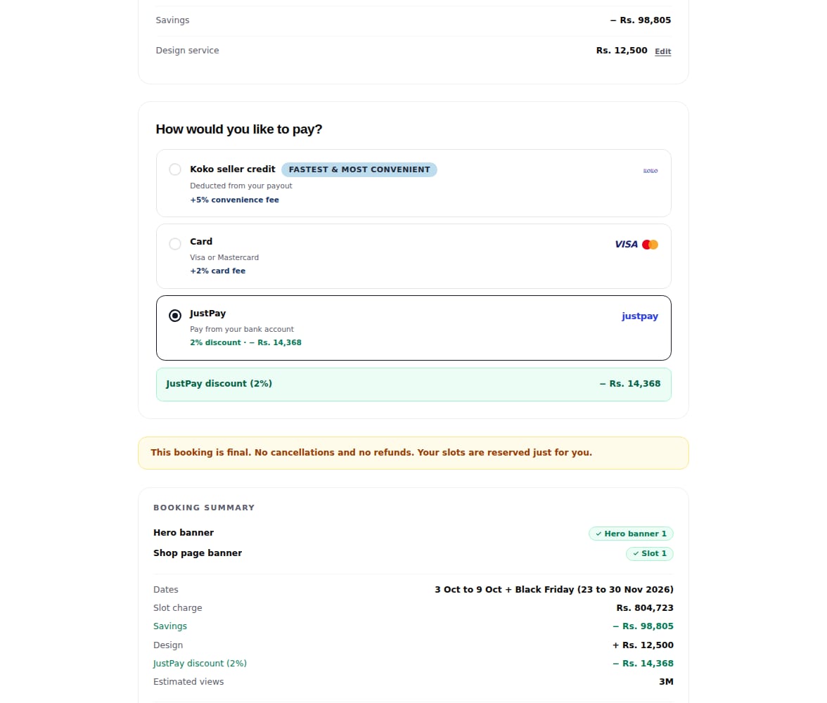
The total starts at Rs. 0.00 until dates exist. Position pricing follows the position choice; the design fee appears at artwork; payment charges or discounts appear at payment. The amount changes alongside the decision that explains it.
The review table links back to the step behind each line, so changing a decision does not mean starting again. Confirmation reads the stored booking, and the booking appears in My bookings after completion.
06 / Outcome and next test
A working flow, with the next questions still visible.
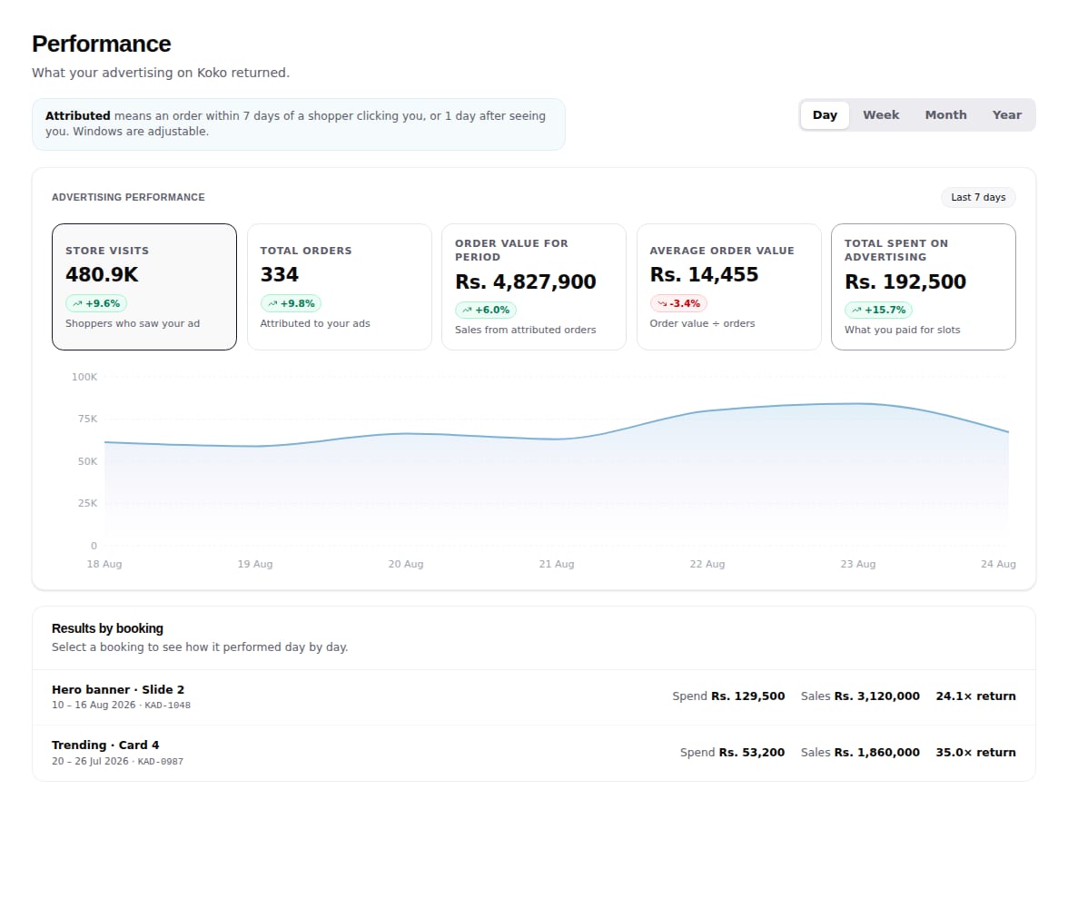
The prototype connects booking to a recap and performance view. Building real pricing rules exposed two pricing inconsistencies and an extension offer that could cross a booked day. Those were design findings that static screens would not have exposed.
The next step is merchant testing: can people explain where their ad appears, how the final amount was formed, and what happens after payment? Finishing checkout alone would not establish that the purchase was understood.
No measured revenue, conversion lift, or merchant usability outcome is claimed. The business model explores inventory capacity using prototype rates.
There’s more to the story.
Explore the research, trade-offs, and interactive examples.