Koko Pay Revamp Case study
A clearer, more trustworthy BNPL app. Built on familiar mental models.
Redesigning 38 screens and the system underneath a payments app while preserving the habits of its 250,000 active users.
Read the story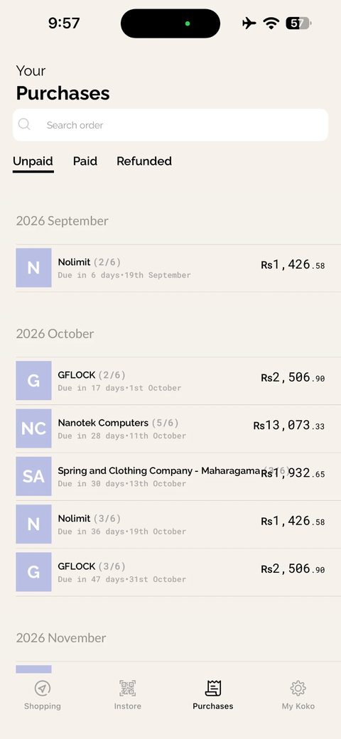
A closer look.
Pre-launch design. Results come from 20 testing participants; survey themes and test findings are reconstructed from notes, and production impact is unmeasured.
01 / The problem
Two apps in one shell.
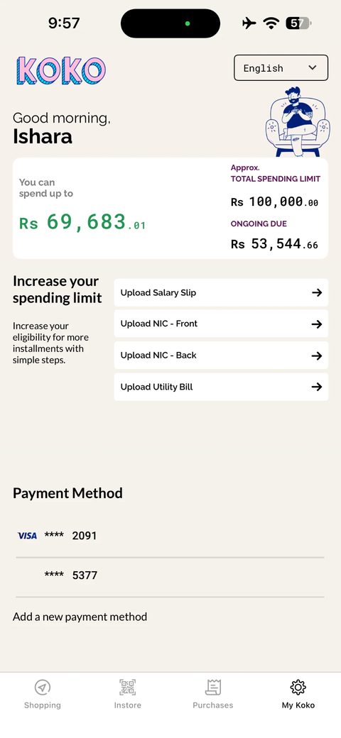
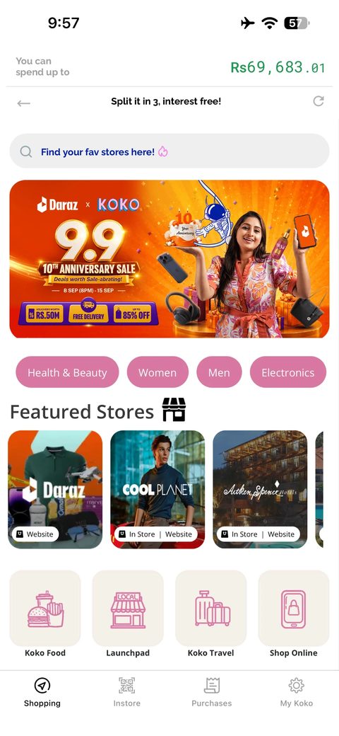
Koko had grown to two million downloads and 250,000 active users on an app built one tab at a time. Money screens and Shopping used different visual systems, and Shopping lived in a webview. The next payment was two taps deep.
As the in-house designer, I covered the audit, discovery, information architecture, Kosmos design system, product screens, and two rounds of testing. The brief was to rebuild the app without breaking the habits that already helped people use it.
02 / What research changed
The first problem was trust in a number.
The audit highlighted the fragmented interface. A discovery survey of 60 existing users and interviews put money confusion first: people could not reconcile the limit, available amount, and ongoing due shown on the spending card.
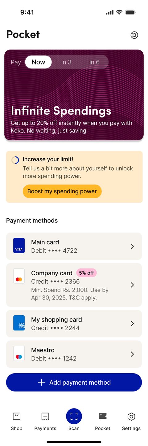
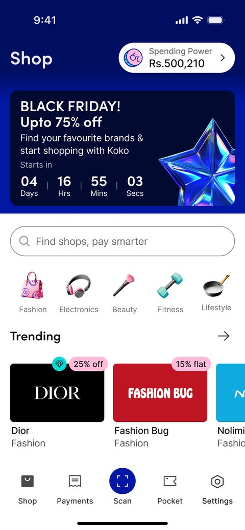
The redesign uses one term, Spending Power, with a plan control for pay now, split in three, or split in six. The figure answers the question behind the arithmetic: what can I buy today on the plan I intend to use?
Survey theme counts are reconstructed from workshop notes and the affinity map. Interview quotes in the detailed study are paraphrased composites.
03 / The judgment call
Testing said to change less.
My audit proposed a new Home tab. In the first test round, six of ten existing users paused while looking for “the shop”. Four read the proposed “Upcoming” payment label as promotions. Both changes were reasonable on paper and wrong for these users.
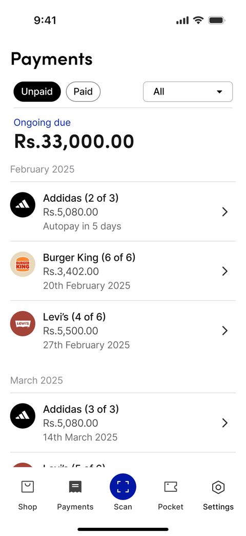
Shop stayed first, with Spending Power in its header. Payments remained second, and Unpaid and Paid kept their familiar labels. The balance and next-payment jobs could be addressed without adding a new destination.
04 / Show the consequence
Put dates and rules before the decision.
The plan picker now reveals instalment dates and total payable within the chosen plan. Review brings the plan, payment method, and totals together before confirmation. The customer sees the commitment while choosing it.
Payments groups instalments under their order instead of treating each as a separate purchase. Rescheduling shows its 14-day window, fee, and once-only rule on the sheet, after testing found that the fee arrived too late.
05 / Make the improvement repeatable
One library underneath every screen.
Kosmos replaced separate visual systems with one Figma library of tokens, components, and states. It took about six weeks up front; the last two months of screens were built almost entirely from existing components.
The handoff rule was simple: only Dev Ready components reached engineering. All 38 screens in the study are instances of the library, and the web team consumed the same token export. Shared states made the reasoning reusable as well as the styling.
- Two typefaces replace four, with tabular figures for amounts.
- Selected plan options carry their instalment schedule.
- Loading, overflow, and feedback states belong to the components.
06 / Evidence and limits
Useful testing evidence before launch.
Ten existing users tested the Play prototype in a moderated first round. Ten new users tested the revised build in an unmoderated second round. Tasks included finding Spending Power, checking out, finding the next payment, rescheduling, and adding a card.
Across the twenty sessions, the average satisfaction rating was 4.6 out of 5 and all participants completed checkout on the first attempt. Nine of ten existing users said they would switch without hesitation. The more useful design lesson was that familiar habits deserved evidence before they were changed.
The app has not launched. Questionnaire results describe these participants, and findings are reconstructed from session notes. Missed-payment rates, support demand, and live adoption remain launch measurements.
There’s more to the story.
Explore the research, trade-offs, and interactive examples.